13+ minutes.
The average call-light response time, shown first.
A landing page that explains a new kind of nurse call in seconds: no hardware, no IT project, live in minutes.
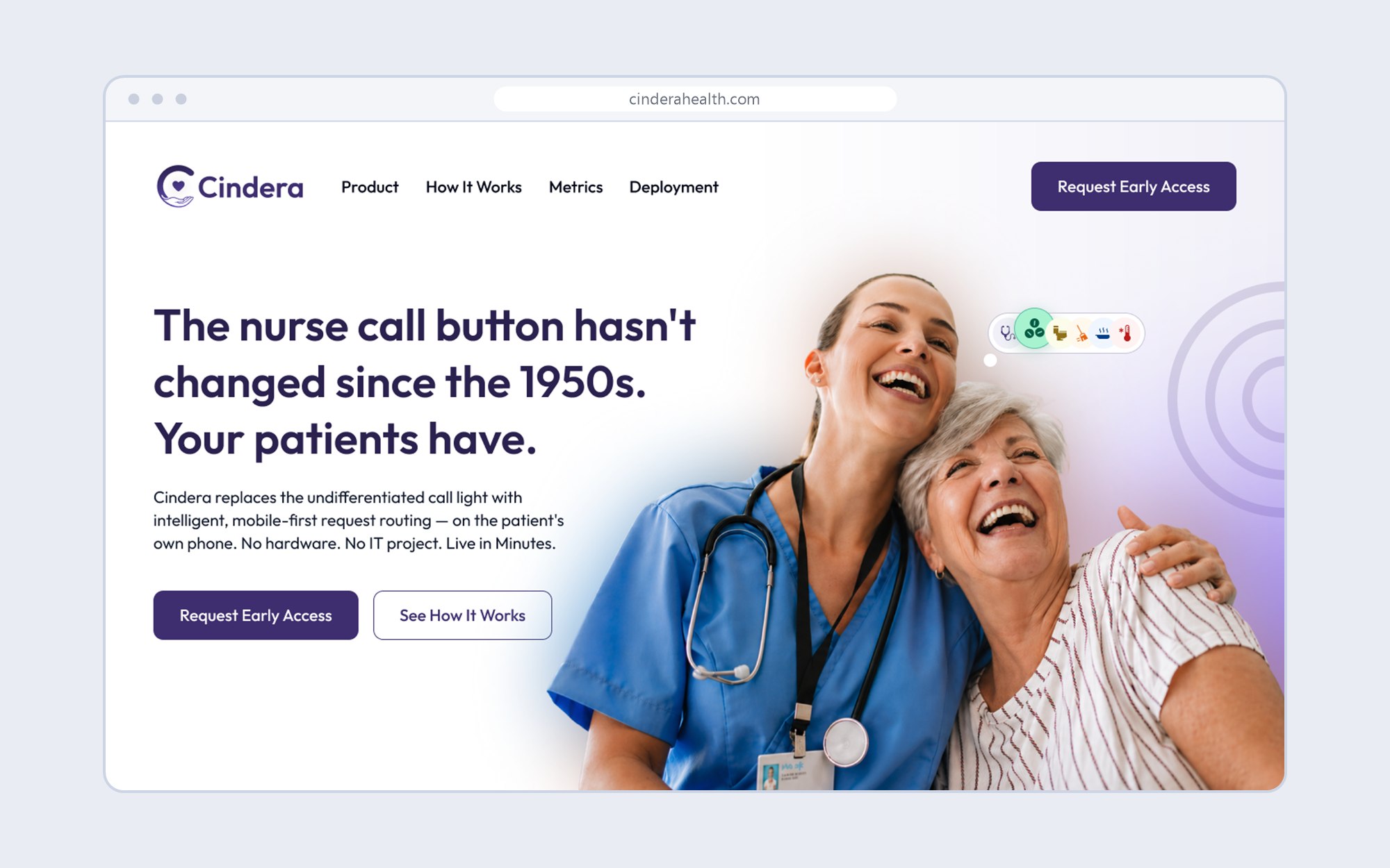
The Cindera landing page design.
A warm photo, deep indigo, and one colour for each idea.
Each section answers the question a hospital buyer has at that moment.
 1
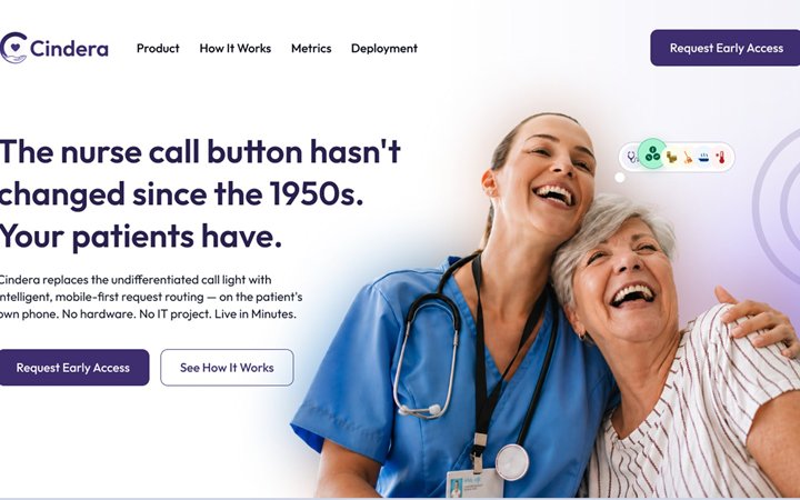
What is Cindera?
The problem in one line, and the fix beside it.
 2
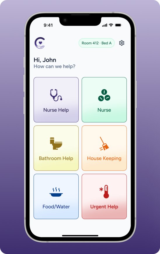
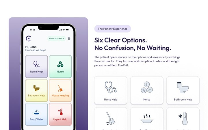
What do patients see?
Six clear options, no confusion.
 3
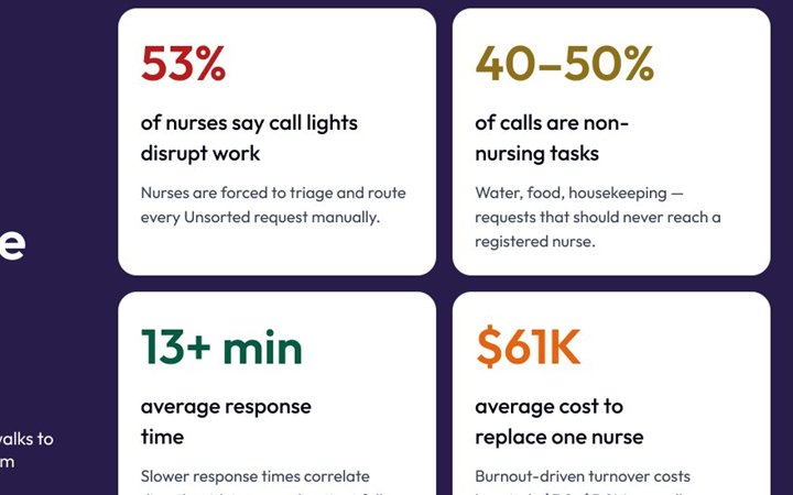
How big is the problem?
Four statistics, each on its own colour.
 4
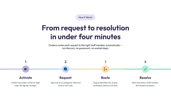
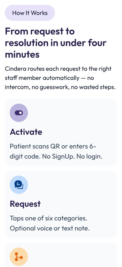
How does a request travel?
Activate, request, route, resolve.
 5
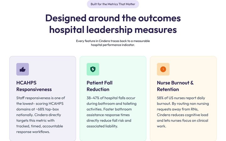
What will it change for us?
Tied to HCAHPS, falls and nurse burnout.
 6
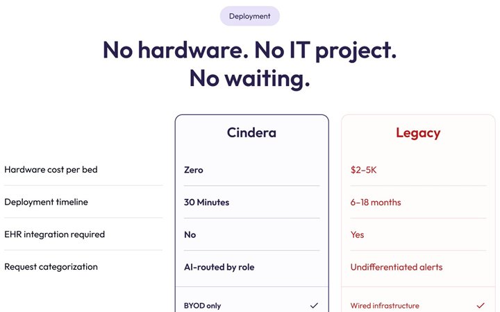
How hard is it to deploy?
A side-by-side table against legacy systems.
The average call-light response time, shown first.
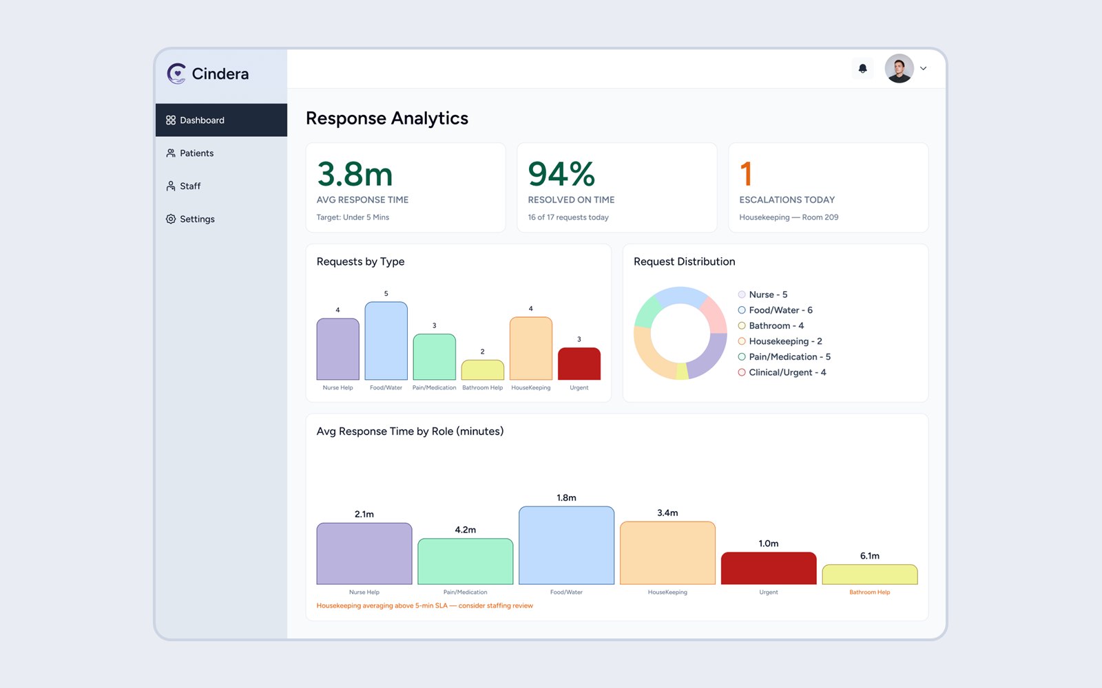
The web dashboard behind the product.
Visit the live site ↗Cards stack into one column, each readable alone.
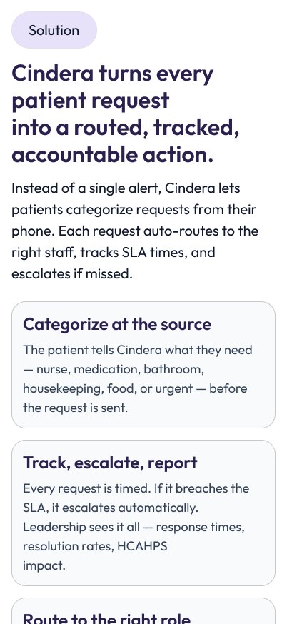
A hospital buyer recognises their own problem before anything is offered.
Four statistics carry the argument.
Three steps, and a comparison with legacy systems.
It ends where a leader can act: request early access.
Visit live website ↗A mobile app where a circle of trusted people saves, borrows and invests together.